Guides & articles
Best Halloween ads: 7 campaigns and the lessons to steal
Best Halloween ads from Burger King, Pepsi, UNICEF and NYX, dissected into lessons any local advertiser can reuse on the screens of their own neighbourhood.
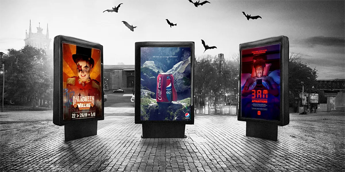
The best Halloween ads all do the same three things: they borrow a fear code everyone already knows, they twist it with humour or purpose, and they show up exactly where their audience is at that moment. Burger King, Pepsi, UNICEF and NYX have all proved it in their own way.
This is not just a costume parade. For each of the seven campaigns below, we extract the lesson a local advertiser can steal: the creative principle, the context, the timing, and how to apply it on the screens of your own neighbourhood.
What makes the best Halloween ads memorable?
Halloween hands advertisers something rare: a shared visual language. Pumpkins, 3 am, blood, costumes, haunted houses. Nobody needs the reference explained, so the creative can spend all its energy on the twist instead of the setup.
That is why the season rewards small advertisers as much as giants. The codes are free. What separates the memorable campaigns from the forgettable ones is what they do with them: a wink, a subversion, a precise moment, a precise place. Keep that lens on for the seven campaigns that follow.
How did Burger King make fear funny in France?
Burger King France, with its agency Buzzman, leaned fully into horror-film grammar: a dark atmosphere, unsettling visual effects, suspense built shot by shot. Then it punctured the tension with a joke, because in France humorous advertising is part of the brand’s identity.
The “scary but fun” mix works because fear captures attention and the laugh releases it, and the release is what people remember and share. It also travels well to a young audience raised on horror content.
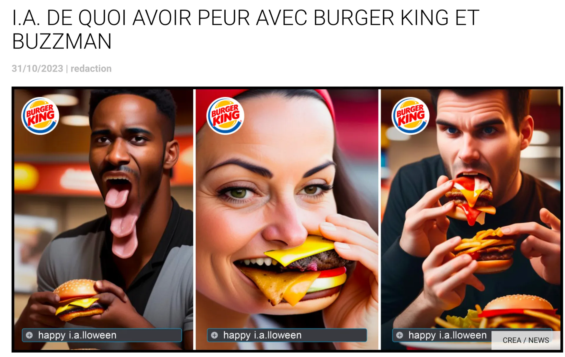
Happy I.A.lloween: Burger King France and Buzzman turned the uncanny side of AI-generated images into the scare itself.
What to steal: you do not need a new idea, you need a familiar code and a wink. One strong visual, one twist, zero explanation: your audience has seen every horror film you are quoting, so they finish the joke for you.
Why did Burger King’s “3AM Apparitions” work?
Same brand, different weapon. Every night during Halloween week, at 3 am sharp, users of the Burger King app could unlock exclusive free meals. The visual said it all: a character startled in bed by the red glow of a digital clock.
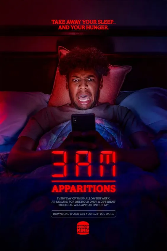
The 3AM Apparitions visual: the digital clock is the monster.
The campaign turned an hour of the night into the creative itself. Scarcity, ritual, insomnia: the mechanic created a genuine nighttime experience rather than another discount.
What to steal: timing is a creative decision, not a media detail. Burger King did not buy attention at 3 am, it made 3 am the message. On digital screens you choose the hours your message plays, and during Halloween week the season lives after dark.
How does Walibi fill its park every Halloween?
The Walibi amusement park in Belgium turns its attractions into haunted houses and wraps the whole park in a terrifying atmosphere. It has done so year after year, until “Halloween at Walibi” became an appointment that families and young adults plan for.
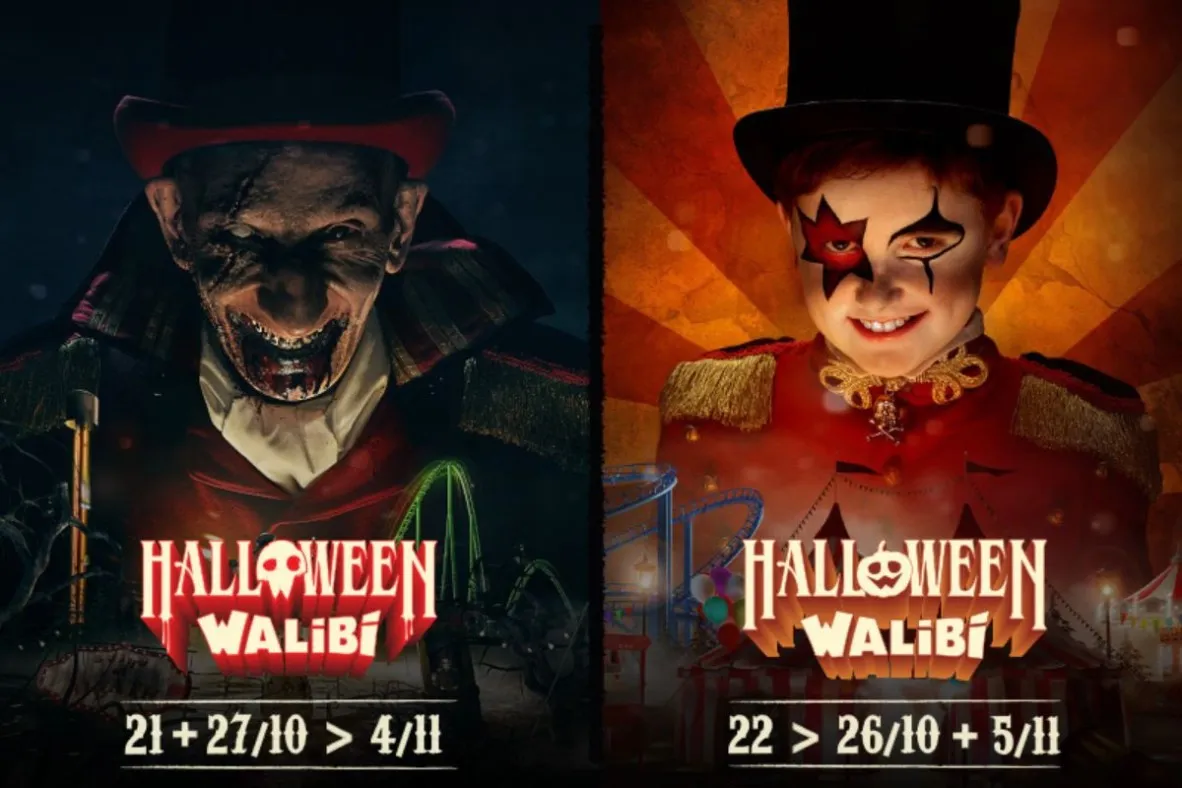
Same appointment, new faces: each edition gets its own characters, the dates do the rest.
The promotion matches the ambition: the event is pushed through digital campaigns and through digital out-of-home (DOOH: screens in streets, malls and stations), along the routes its visitors actually travel.
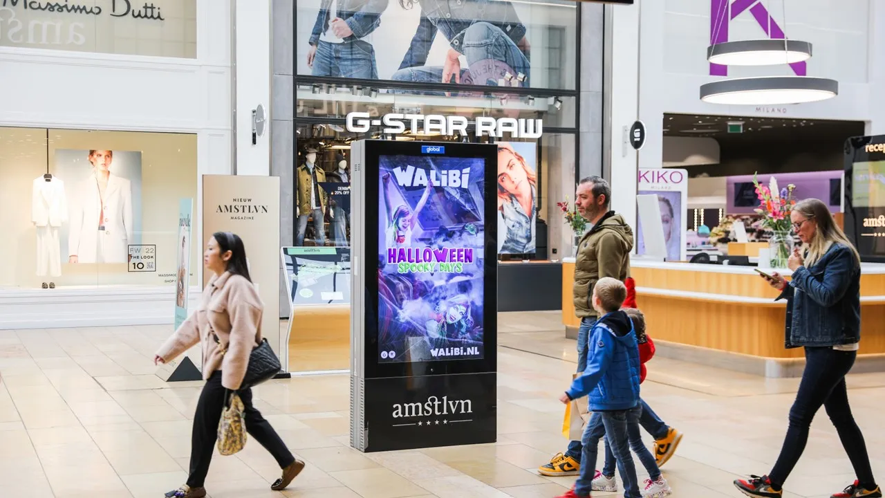
The campaign in situ: a digital screen in a shopping centre, right on the way to the weekend plans.
What to steal: repetition builds an appointment. If you run a seasonal event, promote it in the same period, in the same catchment, every year. Screens between your audience’s home and your venue do the reminding for you.
Can a Halloween ad serve a serious cause?
The French Blood Establishment (EFS) used the season to encourage blood donation, hijacking the visual codes of horror for a public-health message. Blood, vampires, Halloween: the link is literal, which is exactly why the subversion lands instead of feeling opportunistic.
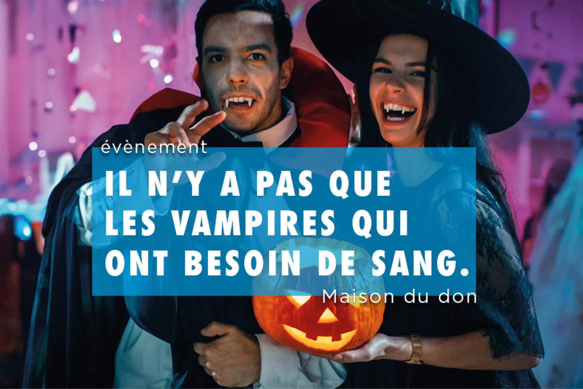
“Vampires are not the only ones who need blood”: the horror code, hijacked for a public-health message.
What to steal: subversion works when the connection is honest. If your product or cause has a real link to the season’s imagery, twist the code. If it does not, borrowing the aesthetic just makes you one more pumpkin in the feed.
That covers the European half of the teardown. Now let’s cross the Atlantic.
What does the 2014 Coke vs Pepsi duel teach?
Pepsi dressed its can in a Coca-Cola cape with the slogan “We wish you a scary Halloween”. Coca-Cola’s answer reused the exact same visual with a new caption: “Everyone wants to be a hero”. The disguised insult became a victory lap, and the exchange went around the world.
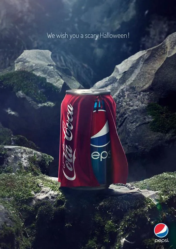
The opening move: Pepsi in a Coca-Cola cape. Coca-Cola’s reply reused this exact visual with a new caption.
The lesson is not the rivalry, it is the reactivity. The best creative of the duel was a caption written after the attack.
What to steal: speed is a creative advantage. Digital screens let you update a message in hours, not weeks. React to the weather, to local news, to a rival’s window display. The answer is often stronger than the opening move.
How did UNICEF turn bus shelters into donation boxes?
For its “Trick or Treat for UNICEF” campaign, the organisation equipped New York bus shelters with festive QR codes. Passers-by scanned, landed on an interactive page, explored UNICEF’s initiatives and could donate on the spot.
A poster became a measurable action, in the street, during the exact week when “trick or treat” is on everyone’s mind.
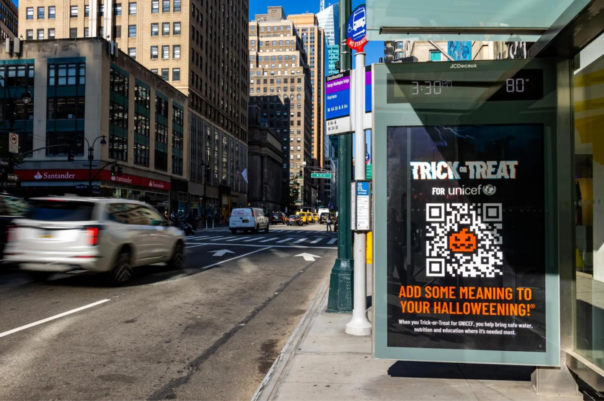
A bus shelter as donation box: scan, land, give, all without leaving the street.
What to steal: a QR code turns a screen into a door. Point it at one clear action (book, order, donate, RSVP) and you get a direct, countable path from the street to your till.
Why did NYX bet on New York screens for Halloween weekend?
NYX Cosmetics, working with JCDecaux, ran a DOOH campaign across digital screens in New York bus shelters and newsstands, inviting the city to get Halloween-ready with its makeup. The goal was straightforward: drive online and in-store sales during the one weekend when everyone needs face paint.
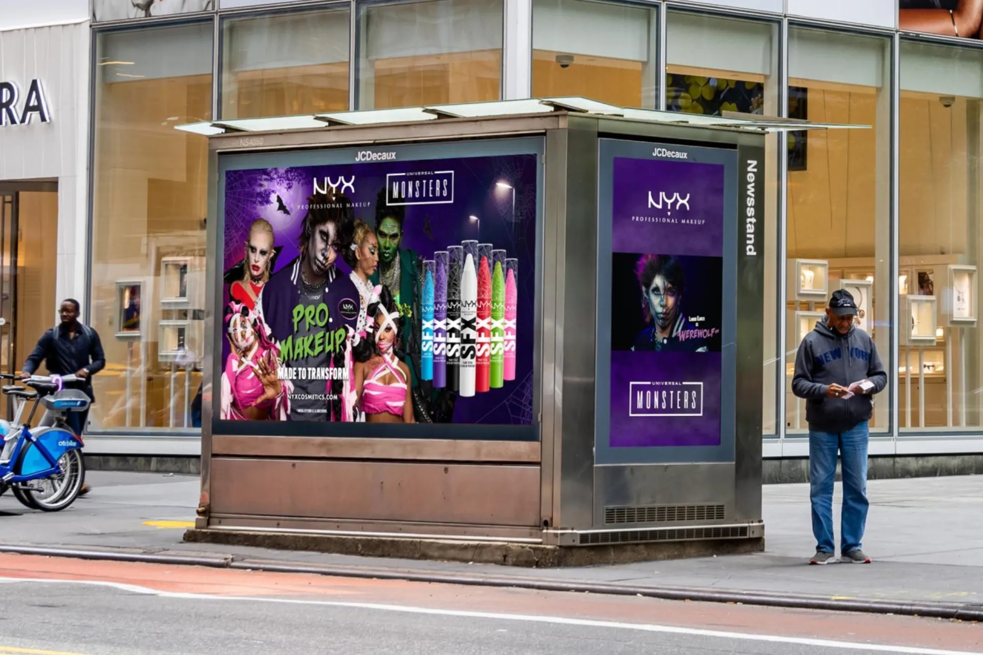
NYX and Universal Monsters on New York newsstands, days before the one weekend that matters for face paint.
Makeup and Halloween is a perfect contextual match, and context is not decoration: context-matched messages earn +17% spontaneous recall (The Moments of Truth, Bauer Media Outdoor, JCDecaux, Posterscope).
What to steal: sell the moment of need, not the product in general. NYX did not advertise makeup, it advertised being ready for Halloween, days before the deadline. Ask what your customers need on the 28th that they will not need on the 2nd, and build the message around that window.
What should a local advertiser steal from all this?
Seven campaigns, one pattern. Put together, the checklist looks like this:
- Use a code everyone knows, and spend your creativity on the twist.
- Treat timing as part of the creative: own an hour, a week, a season.
- Repeat the appointment every year in the same catchment.
- Subvert the codes only when the link to your business is honest.
- Stay reactive: the second move can beat the first.
- Give the street one scannable action.
- Match the message to the moment of need.
None of this requires Buzzman’s budget. It requires screens within reach of your audience, in the neighbourhoods where they live, move and buy, and creative you mostly already have: the Halloween posts you make for social can get a second life in the street, adapted to screen formats without redoing the work. That is exactly what glooh is built for: simulate your Halloween campaign for free and see what these seven lessons look like in your own neighbourhood.
Halloween ads: your questions answered
When should a Halloween campaign go live?
The last two weeks of October carry most of the season, with a peak in the final days before the 31st. Digital screens can be booked and live in a few days, so a mid-October start is realistic even if you are reading this late.
Do Halloween ads only work for big brands?
No. The season’s codes are free and universally understood, which lowers the creative bar. A local business buying screens in its own catchment competes on relevance, not on budget.
What kind of creative works on screens for Halloween?
One bold visual, very few words, and motion if the screen allows it. The campaigns above all pass the three-second test: code, twist, brand. Reusing your existing social assets is usually enough.
Is it worth adding screens to a digital campaign?
Adding DOOH to a digital plan raises campaign effectiveness by +56% (OAAA). For a seasonal push like Halloween, the street reminds people of what the feed showed them.
The brands in this teardown had agencies and global budgets. The mechanics they used are available at the scale of a neighbourhood, on screens that are already there. Plan your campaign and see your price: the simulator is free, and it shows what your own Halloween week would look like.